RC-010 | Quilt Planning
Choosing fabrics that look beautiful together is one of the most enjoyable parts of quilting—and one of the easiest places to feel uncertain. The good news is that successful fabric coordination is not about finding a perfect set of matching colors. It is about balancing color, value, contrast and print scale.
Quick answer: How do I choose fabrics that work together?
Start with one fabric you love, identify its dominant and accent colors, then build a group that includes meaningful differences in lightness and darkness. Mix large, medium and small-scale prints, and add quieter blenders or basics so every fabric is not competing to be the focal point.
Start with a focal fabric
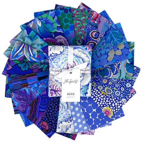
A focal fabric can be a large floral, scenic print, novelty design, panel or any fabric that establishes the palette. Pull colors directly from that print instead of trying to coordinate from memory.
Color is only one part of the decision
Several fabrics can share the same color family and still disappear into one another if their values are too similar. That is why a quilt made from beautiful individual fabrics can look visually flat once the pieces are sewn together.
What is value?
Value means how light or dark a color appears. Strong value contrast helps block shapes remain visible. A palette often benefits from a deliberate mix of lights, mediums and darks.
One easy test is to photograph the fabrics together and view the image in grayscale. Fabrics that looked very different in color may suddenly appear almost identical in value.
What is print scale?
Print scale refers to the relative size of the motifs. A balanced group often includes a larger focal print, medium-scale coordinates and smaller prints or tonals. If every fabric has equally large, active motifs, the block design can become difficult to read.
What are blenders?
Blenders are subtle prints that read almost like solids from a distance. They can include texture, mottling, dots, tiny motifs or tonal variation. Blenders are useful because they add depth without competing with focal prints.
Batiks can function especially well as textured blenders. See What Are Batiks?.
Do fabrics have to come from the same collection?
No. Manufacturer collections make coordination convenient, but they are not a rule. Fabrics from different collections and manufacturers can work beautifully together when the color, value, scale and style support the design.
Browse quilting fabric by the yard when you need coordinates beyond the original collection.
How many fabrics should I use?
The pattern usually gives the best answer. A two-color quilt may depend on strong contrast, while a scrappy quilt may use dozens of fabrics. More fabrics are not automatically more interesting; the design needs enough distinction for the block structure to remain visible.
How do I coordinate a quilt panel?
Choose one dominant color, one secondary color and one accent from the panel. Use quieter fabrics directly around detailed artwork, then introduce stronger coordinates farther away if the design allows.
See What Is a Quilt Panel? for panel-specific planning.
Warm and cool colors
Warm colors such as reds, oranges and many yellows tend to advance visually, while cool colors such as blues and many greens often recede. You can use that relationship intentionally to emphasize certain blocks or create depth.
Neutrals are not only white and beige
In quilting, a neutral can be any fabric that behaves quietly within the palette. Navy, charcoal, cream, pale aqua or a low-volume print can all function as a visual resting place depending on the project.
Common coordination mistakes
1. Choosing only by exact color match
A successful palette can include variation in hue. Value and contrast often matter more than perfect matching.
2. Using all medium-value fabrics
The design may lose definition even if the colors are attractive.
3. Using too many competing focal prints
Give the eye somewhere to rest.
4. Ignoring the scale of the cut pieces
A beautiful large motif may disappear or become confusing when cut into tiny units.
5. Forgetting the final viewing distance
A quilt seen across a room reads differently from fabric examined six inches away.
A simple fabric-pull method
- Choose one focal fabric.
- Pull two or three colors from it.
- Add at least one light and one dark.
- Add a quiet blender or basic.
- Check print-scale variety.
- Photograph the group in grayscale to check value.
- Remove any fabric that demands attention without helping the design.
The bottom line
Coordinating quilting fabric becomes much easier when you stop asking only, “Do these colors match?” and start asking, “Do these fabrics have enough contrast, value range and scale variation to support the design?” Start with a fabric you love, build around it deliberately, and let quieter fabrics do some of the work.
Continue learning: What Is Quilting Cotton? | What Are Batiks? | What Is a Quilt Panel?